
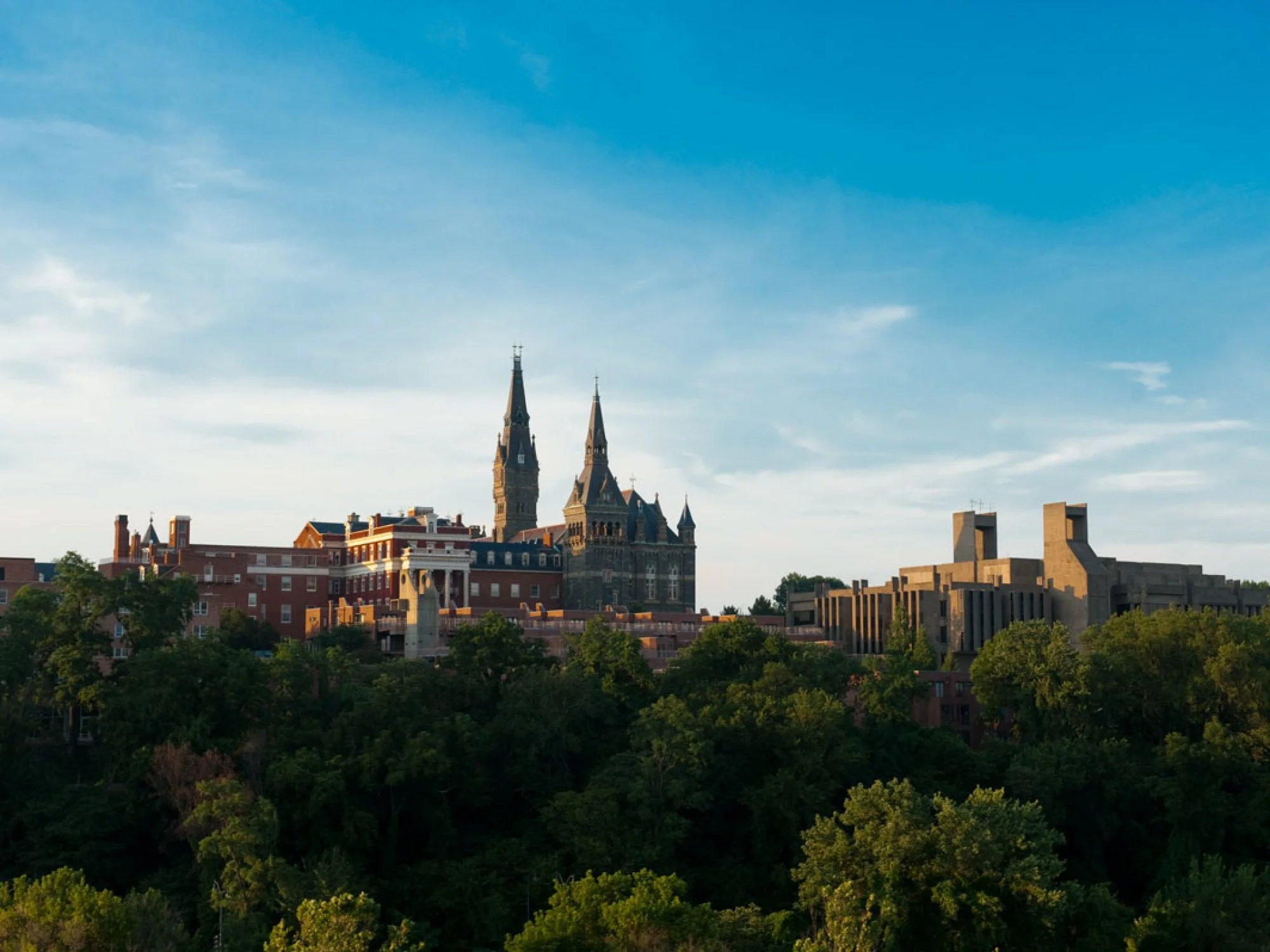
Background
I have worked as a senior graphic designer at Georgetown University in the Office of Advancement for the past two years. Our new giving campaign was designed entirely in-house over 6 months with a limited budget. Georgetown has existing brand guidelines but the Office of Advancement's design team also had to develop a new guidebook specifically for campaign specifications.
See the live site here: https://calledtobe.georgetown.edu
The Problem Space
One question our team grappled with is how might we reflect the wide range of experiences of our alumni in our campaign. After determining the look, feel, and messaging as a team, I was responsible for determining how those guidelines would be reflected in the campaign website.
The Result
The website is currently live, and has served as a useful tool for both prospective donors as well as donor relations coworkers. The website will continue to evolve over the next three years and new voices will be showcased throughout the year in the stories section.
User Research
Respondents were shown a series of four mood boards for feedback. Each mood board had an associated theme that was shared with participants. Names for each mood board theme were provided by Georgetown. Participants were shown each mood board one at a time, followed by a series of diagnostic questions.


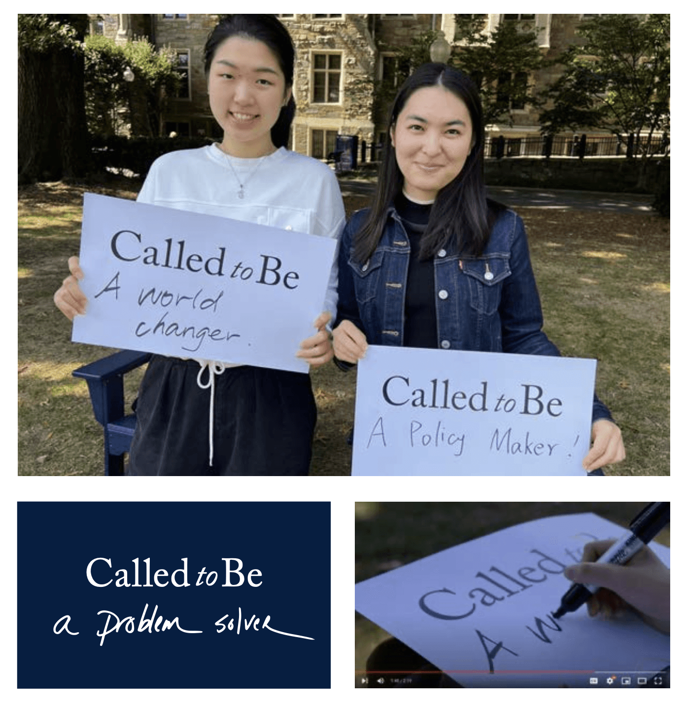
Handwriting
We use handwriting to express a person’s unique calling and help tell the stories of members of the Georgetown community in their own authentic voice. The very act of writing or recording your calling often serves as a catalyst to take action. Due to the personal nature of handwriting, we do not use stock or typefaces for handwriting.
Opportunity Filter
There are over 100 fundraising opportunities that donors can contribute to in this campaign. I had to figure out a way to display these opportunities in a way that users could easily find the subjects they were interested in.